I was thinking about uncertainty in model predictions while out running recently. This was in part driven, as so many of my thoughts are these days, by thinking about the current COVID-19 pandemic. I’ve heard people say that the projections for these models are so uncertain, it must mean scientists don’t know enough about the disease for modeling to be useful. In my own research, I often deal with sensitivity and uncertainty analysis, and based on my experiences, I believe the idea that the presence of uncertainty makes something unhelpful is counterproductive. (FYI - there’s really great information regarding the COVID-19 modeling on both the CDCs website here - https://www.cdc.gov/coronavirus/2019-ncov/covid-data/forecasting-us.html - and the FiveThiryEight website here - https://projects.fivethirtyeight.com/covid-forecasts/).
While I think uncertainty is something that is increadibly important for the general public to understand, I haven’t actually focused on this much in my teaching. I was thinking of all this as I was running along, and I started thinking about how one way to demonstrate uncertainty is to show how relatively simple variation in personal choices could lead to uncertain outcomes. This started with me thinking about the effects of how people abide by social distancing guidelines, but drifted to “I wonder how my personal choices on my running in any given week effect how many miles I run during the year?” While not nearly as profound, or as important, as disease modeling, teaching complex ideas is often best done with personalized examples. So here we go …
Simulating Matt’s annual running milage
Load packages that will be used in this analysis.
library(dplyr)
library(ggplot2)
In general, I run 3 to 4 days a week, 4 to 10 miles per run.
Days per week
Some weeks I don’t run at all and some weeks I run more than 4 days. But again, in general it’s 3 or 4 days. To simulate the uncertainty in this number, I drew 52 values from a Poisson distribution with a mean (\(\lambda\)) of 3. The 52 values represent 52 weeks in the year. I modified the results just a little to make the max value for any given week 5 days.
Miles per run
For any given run, I head out for somewhere between 4 and 10 miles. (My ego feels the need to point out that when I’m training for a longer race, I do longer runs, but that’s not really important for this exampel.) Anyway, I do more shorter runs during any given week, and generally only do 1 or at most 2 longer runs. To generate my total weekly milage, I am using the sample function with a prob argument, which allows me to upweight the probability of doing a shorter run than a longer one.
Simulate a single year
Here is a function to simulate the total miles run in a single year.
sim_annual_run <- function(){
  # Set up a data frame
  annual_run <- data.frame(week = 1:52)

  # Randomly select number of days for each week
  #annual_run$num_runs <- sample(x = 2:4, size = 52, replace = TRUE)
  annual_run$num_runs <- rpois(n = 52, lambda = 3)
  annual_run$num_runs <- ifelse(annual_run$num_runs > 5, yes = 5, no = annual_run$num_runs)

  # Randomly select total milage for a week
  get_tot_milage <- function(days){
    return(sum(sample(x = 4:10, prob = c(3, 3, 3, 1, 1, 1, 0.5), size = days, replace = TRUE)))
  }

  annual_run$tot_milage <- sapply(annual_run$num_runs, FUN = get_tot_milage)
  return(annual_run)
}

annual_run <- sim_annual_run()
Below is a plot of the cumulative milage run for this year, throughout the year.
annual_run$cumulative_milage <- cumsum(annual_run$tot_milage)

ggplot(data = annual_run, aes(x = week, y = cumulative_milage)) +
  geom_line()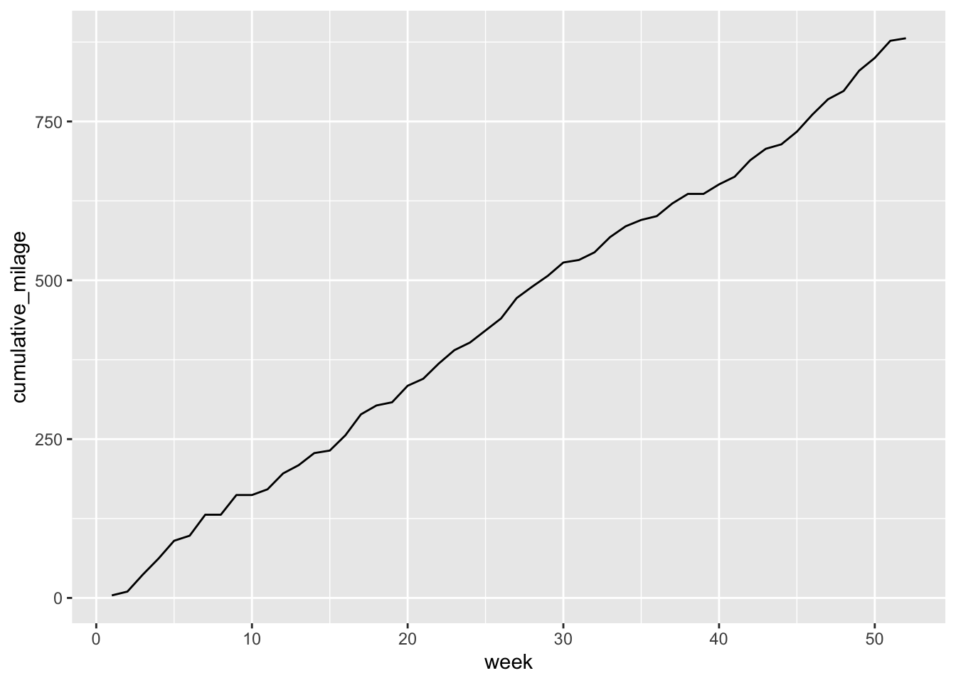
Simulate 1000 different years
Now let’s repeate this a 1000 times to demonstrate the inherent uncertainty involved in predicting how many miles will run in a year.
annual_run_mult <- c()

for (x in 1:1000){
  annual_run <- sim_annual_run()
  annual_run$cumulative_milage <- cumsum(annual_run$tot_milage)
  annual_run$sim <- x
  annual_run_mult <- rbind(annual_run_mult, annual_run)
}

ggplot(data = annual_run_mult, aes(x = week, y = cumulative_milage, group = sim)) +
  geom_line(alpha = 0.1)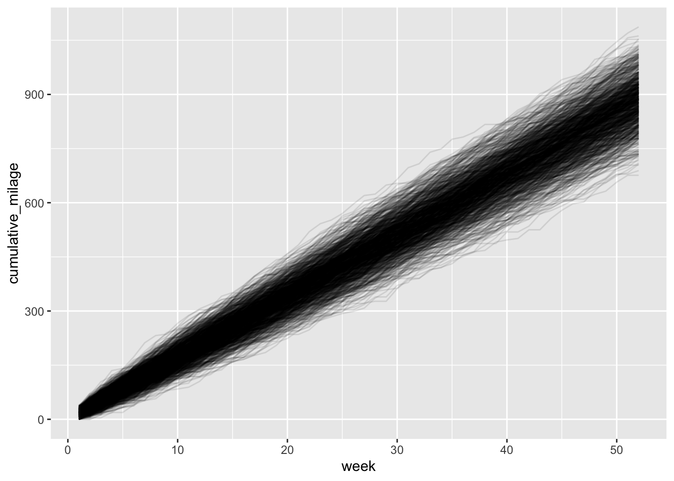
The plot above shows 1000 different “paths” to my annual total running milage. What should be clear is just how many different outcomes are possible with this relatively small set of uncertain variables (two variables to be exact!). What’s more, for each variable, there isn’t an excessive amount of variation. So this is really a demosntration of how a relatively small amounts of variation propagates into a large amount of uncertainty of a final outcome.
Just to put some numbers on this, let’s get some summary stats. Note the Inter-Quartile Range (Upper_Quart - Lower_Quart) and the Coefficient of Variation.
week_52 <- filter(annual_run_mult, week == 52)

week_52 %>%
  summarise(Average_Milage = mean(cumulative_milage),
            SD_Milage = sd(cumulative_milage),
            Coef_Variation_Milage = sd(cumulative_milage)/mean(cumulative_milage),
            Lower_Quart = quantile(cumulative_milage, probs = 0.25),
            Upper_Quart = quantile(cumulative_milage, probs = 0.75),
            Max_Milage = max(cumulative_milage),
            Min_Milage = min(cumulative_milage))
## Average_Milage SD_Milage Coef_Variation_Milage Lower_Quart Upper_Quart
## 1 883.074 65.74938 0.07445512 839.75 926
## Max_Milage Min_Milage
## 1 1087 676